Whose Font is it Anyway?
In August 2025, Are.na announced a new typeface, and many in the visual design industry applauded what, in any other register, they would call theft. The typeface is Areal, drawn by Dinamo: a revival of Arial, entirely redrawn and rebuilt. Arial has always been a digital typeface, and this revival required archaeology: Dinamo worked with computer archivists to find machines old enough to run Arial v2.82, the version Microsoft selected as a core font for the web in 1996, screenshotted the letterforms on period hardware, and traced them into new outlines. Are.na had used Arial for fifteen years; it would now use Arial's ghost. The response was warm, and a year later Dinamo released Areal free to everyone. The applause rested on an assumption so familiar it went unspoken: authorship confers ownership, so copying the copyist is a kind of justice. Arial belongs to Monotype the way conquered provinces belong to empires, and maybe taking it back feels like restitution.
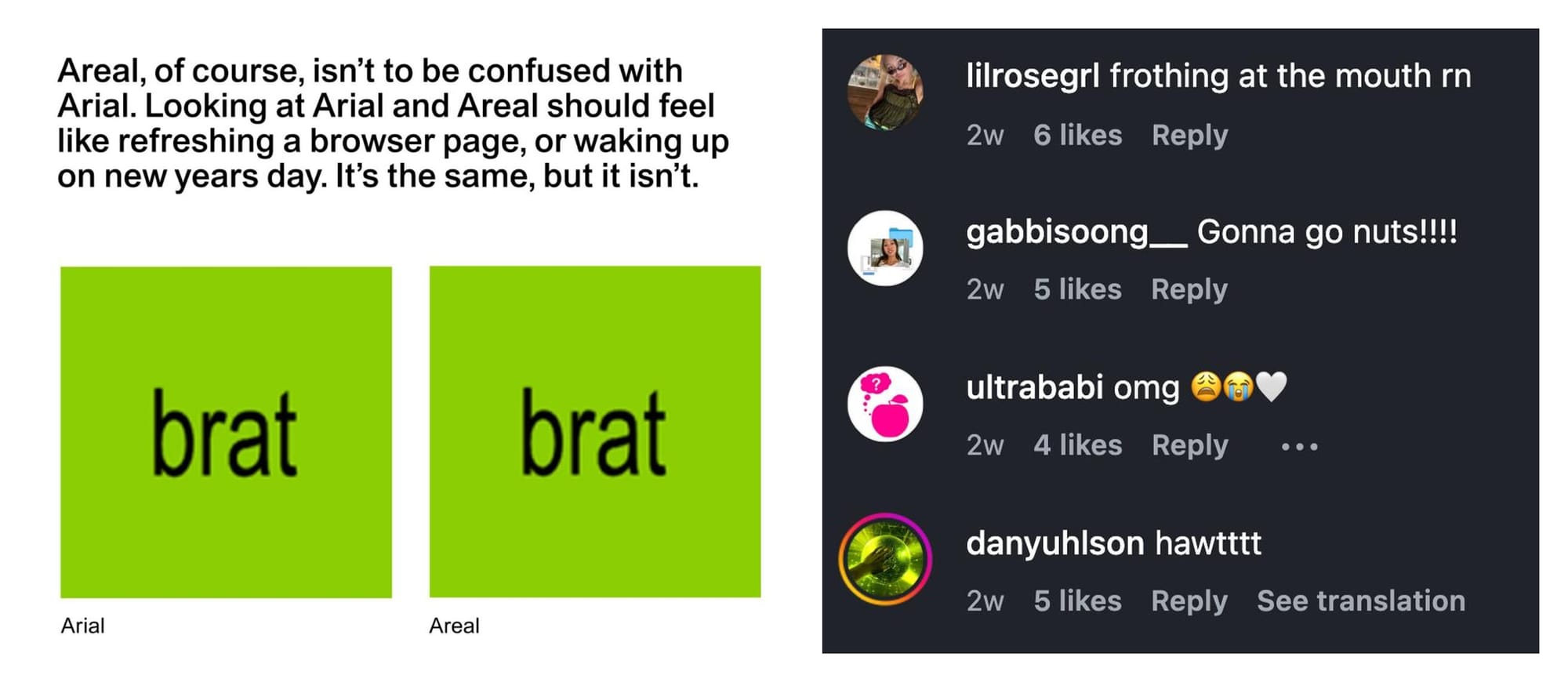
The first comedy: Arial was the copy. IBM commissioned it from Monotype in 1982 because it wanted something like Helvetica for its laser printers; Microsoft bundled it with Windows 3.1 and later made it a core font of the web, which is how a metric clone became infrastructure. Are.na did to Monotype what Monotype did to Linotype, at a fraction of the scale, with better manners. The redraw of Arial is a copy of a copy, and the original copy sits on every computer on earth.
Our industry, in recent years, (mostly) describes AI training as theft. Both verdicts are held with complete sincerity, and they are never introduced to each other. Hypocrisy is cheap, and everyone here can afford it; to me, the more interesting question is what ownership in this trade has ever actually been.
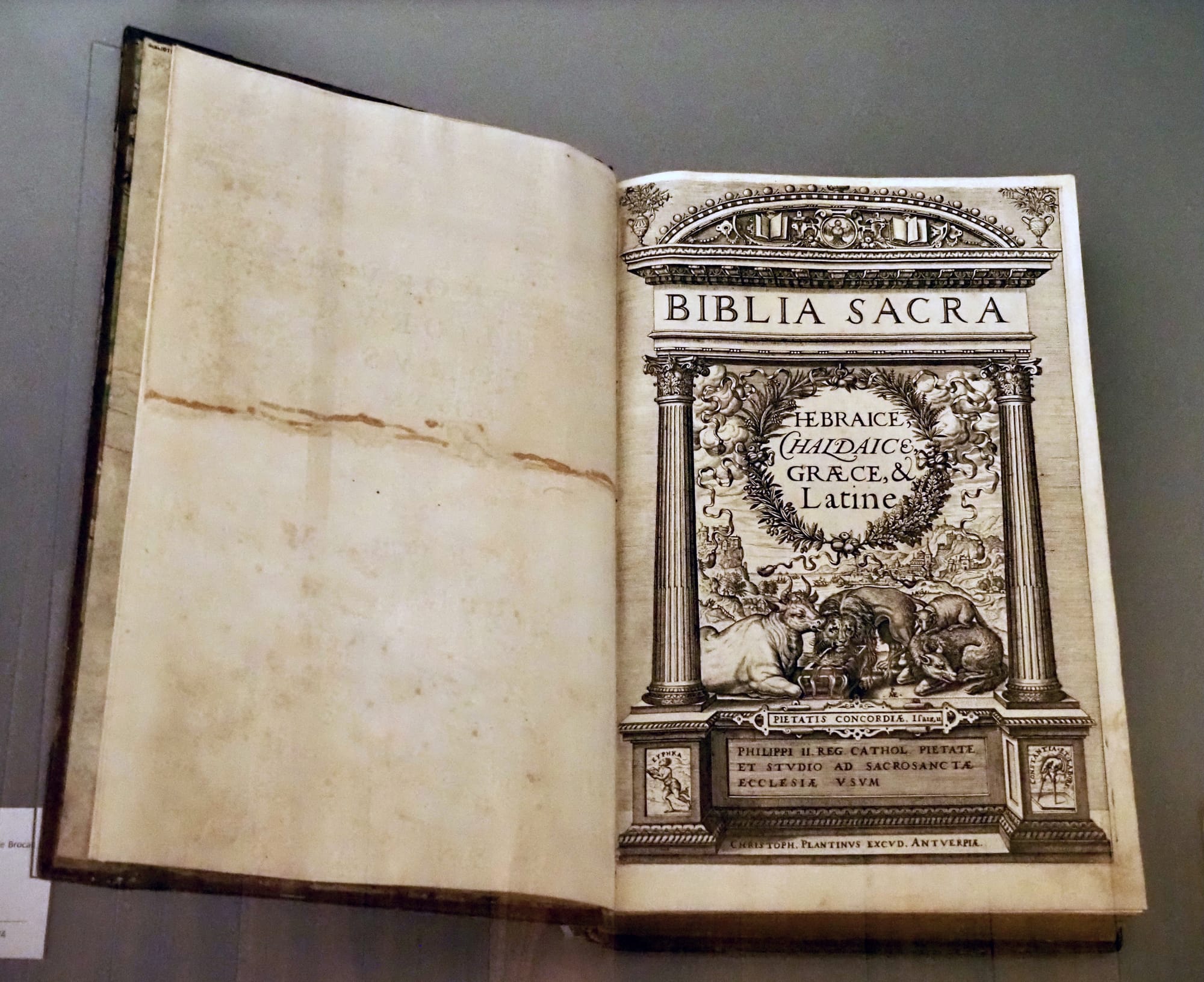
Before there was copyright, there was the privilege. When Christophe Plantin printed his Polyglot Bible in Antwerp, his protection was not a property right in any letterform but a privilege granted by Philip II: a sovereign dispensation to print what others could not. The Dutch Republic issued its privileges through the States-General. England ran the entire trade through the Stationers' Company, chartered in 1557, a guild monopoly over what could be printed and by whom. Ownership in type begins here, as a capacity granted from above to exclude, long before it was imagined as a fact about who made what.

The Dutch Golden Age made the capacity valuable. The United Provinces became the centre of European type founding in the seventeenth century, and the commerce that paid for it was colonial commerce; the same Amsterdam that ran the presses was kept liquid by the returns of the Dutch East India Company. The capacity to produce, hold, and export letterforms floated on brute force-extracted colonial money, as most seventeenth-century Dutch capacity did.
England's tradition begins by buying in. Crown interference had suppressed English type founding so thoroughly that most seventeenth-century English printing used Dutch types, and when John Fell set out to equip Oxford's press, he spent years purchasing punches and matrices from Holland. The Fell types, bequeathed to the university in 1686, are the seed of the English national tradition, and they are an import licence. Caslon, the first great English founder, cut in the Dutch taste a generation later. The traditions were capitalised into being. The inheritance stories came afterward; if that move sounds familiar, it is because the craft essay was about it.
Modern law kept the shape of the privilege and lost the settlement. In France the typeface itself is a copyrightable work; a Paris court said so in detail in 2023. In the United States the shapes are explicitly excluded, "typeface as typeface", and only the font file survives, as software. Germany protects designs but caps the term at twenty-five years, under a design-registration law on the books since 1876, the Geschmacksmustergesetz. The Vienna Agreement of 1973, signed by eleven states, ratified by two, never came into force. West Germany implemented it anyway: from 1981 to 2004, typefaces had their own statute, the Schriftzeichengesetz, before protection folded back into design law. An international law of type ownership has never existed. Britain protects typeface designs for twenty-five years and exempts the ordinary act of typesetting from the right. The same glyph is property in Paris, a computer program in New York, and raw material again in Berlin a quarter-century after publication. What a foundry owns is wherever it can afford to sue.
The sovereign of this arrangement is Monotype. Linotype in 2006, Bitstream and with it MyFonts in 2012, FontShop and FontFont in 2014, URW in 2020, Hoefler&Co in 2021; the company itself was taken private by an equity firm in 2019. At Monotype, the revenue now runs through a subscription platform: the privilege system with a login, administered by compliance and legal teams that sit where the Stationers' wardens used to. The template for one of their best-known assets is instructive: Times New Roman was commissioned by The Times in 1931, debuted on 3 October 1932, remained exclusive to the paper for one year, and was then released for general sale, whereupon it became the best-selling metal face in the library. The client bought a year of distinction; the foundry kept the asset. Almost a century later Are.na received the same schedule from Dinamo: a year of exclusivity, then release. Only the conversion differs. Monotype sold. Dinamo gave away, and banked the reputation.
Because American law protects the file and never the shapes, ownership disputes are forced off the letterforms. When the Hoefler Type Foundry sued its former employee Joshua Darden and his publisher Phil's Fonts over Freight, the complaint reached for everything around the shapes: the employment agreement, the severance agreement, the trade secrets, and sixty fonts it called "unmistakably derived" from Whitney and Mercury, families Darden had himself drawn characters for. Ownership here asserted through contract, because it could not be asserted through the letterforms. The suit was discontinued before any ruling, and Joshua Darden would continue his practice at Darden Studio.
Now hold the screenshot next to the lawsuit. Dinamo did openly what Darden was accused of doing: derived new outlines from an existing font. Darden was alleged to have built Freight on the firm's machines and research. Dinamo traced shapes off images, and an image of a letterform is, legally, nothing; the screenshot converts protected software back into unprotected shapes. The vintage hardware was romantic; it was also, intended or not, hygiene. One man was sued for fonts he drew. A studio was celebrated for fonts it traced. The difference is whose property stood nearby.
The one time someone tested an ownership claim against the free-font pipeline, it reached a Paris courtroom. Jean-François Porchez, who drew Le Monde Journal in 1994, sued Google and Production Type, arguing that Spectral, the text face Production Type built for Google Fonts in 2017, copied his design. The court confirmed the typeface was an original, protectable work, then found no copying: the features that made Le Monde Journal original, it held, did not appear in Spectral. The most sympathetic enforcement attempt imaginable, celebrated designer, friendly jurisdiction, a protectable work confirmed, failed against a free font.
Meanwhile the gifts keep repricing the saleable assets. Google Fonts gave real things, distribution no independent could buy, a quality floor, a commons that survived as content, and it also fixed the retail price of a text face at zero. Dinamo's free release of Areal was celebrated as generosity, which it was. From inside the market, generosity and subsidy are difficult to tell apart; both make the independent retail licence harder to sell.
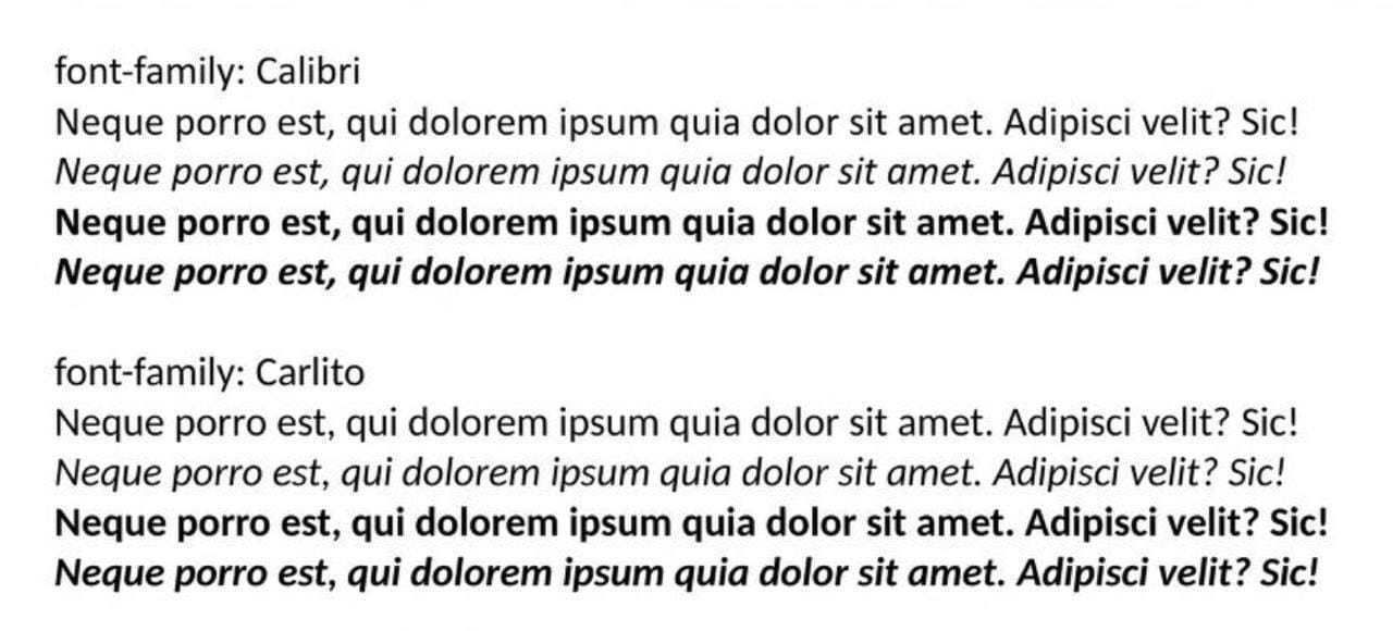
Google ran its own version of this play years earlier, at operating-system scale. For Chrome OS it commissioned metric-compatible stand-ins for Microsoft's core fonts: Arimo, Tinos and Cousine for Arial, Times New Roman and Courier New, later Carlito and Caladea for Calibri and Cambria, so that documents set in Microsoft's metrics would not reflow on machines without Microsoft's fonts. The aim was metric compatibility, not outline facsimile; the letterforms are their own and only the measurements match. The licences were open, Apache for the core three and OFL for all five today, free to modify, examine, redistribute. Areal runs the play in reverse: the outlines are a traced facsimile, and the licence is closed, no modification, no derivatives, no conversion, no training of AI. Google copied the measurements and gave away the rights. Dinamo copied the letterforms and kept them.
Dinamo's side deserves stating. The foundry is no insurgent; it is an established (also beloved by many, including myself) commercial practice, and a good share of its cultural capital comes from standing slightly against the trade's conventions, in its marketing as much as in its catalogue. The slogan pinned to the free release was "only free font is true font". The rollout matched the posture: a microsite styled as an archaeological dig, an editorial interview, and, for the public release, a download party in Greenpoint, Brooklyn. Foundries do not throw parties for ordinary retail releases; Dinamo threw one for a giveaway. The plain reading existed, but it came from outside the trade. When the announcement reached Hacker News, a forum with no stake in type, the thread read the rollout the way the trade would have read it from anyone without Dinamo's standing. One commenter, a font-licensing professional by his own description, called it "a lot of myth-making" and put the revival in plain terms: "we really like Arial for what we do, and we wanted a cleaned-up version of it that we own and could host on the web." Another hoped the technology archivists had charged appropriately for the monumental task of booting Windows 2000. None of it stuck. The font was the gift, and the gift was the campaign, and the cultural capital was the return on investment.

Here is the contradiction the industry will not resolve: the designer who cheers Areal and condemns AI training is running two theories of ownership at once. The redraw is culture; the training run is theft. Both are derived copying at scale, distinguished by who copies, at what volume, and which way the money moves.
So the question was never who owns this letterform. It is who can make an ownership claim stick, and against whom. Watch how the industry has answered AI so far: not with law, which is slow and mostly unavailable for shapes, but with licence language. Lineto's EULA now prohibits using its fonts to train deep-learning systems, in so many words. This is capacity in its modern form: a clause. The Netherlands protects typefaces on paper; when a Dutch foundry did enforce, Typotheque suing over a converted Fedra webfont in 2011, it sued in America, on the American theory that the file is what can be owned. Production Type, on the winning side in Paris, has itself sued Nike in America, alleging the company ran a global brand's marketing on two desktop licences and a set of trial fonts. Even the winner in one jurisdiction has to purchase its capacity again in the next.
Which leaves the two one-year exclusivities. The 1933 sale is what Monotype's inheritance story remembers as tradition; in 2026 ABC Dinamo's gift is what some will remember as defiance of the status quo. Which of those was a rebellion is a question I will leave where I found it.
Is there a lesson here? For the independent foundry, perhaps one: you own what you can defend. Everything above is a record of that sentence, from the Stationers' charter to the MCP licensing server. Typefaces have been treated as property by the parties who could afford the treatment; everyone else's ownership has been a courtesy. So when the licence gets drafted and the distribution deal gets signed, it is worth deciding, deliberately, how you want your work to be interacted with. If you do not decide, the platform decides—and the platforms have already decided.
Correction: an earlier version of this essay attributed Germany's twenty-five-year design term to the 1973 Vienna Agreement. The protection descends from the Geschmacksmustergesetz of 1876. Thanks to type historian Dan Reynolds for the correction.