Visible by Proxy
Type design has maybe always been a solitary form of intimacy. You spend months (sometimes years) refining the shrug of a shoulder, the weight of a stem, the angle at which a terminal cuts. The decisions accumulate into something that carries your sensibility: your sense of rhythm, your relationship to the calligraphic tradition, your tolerance for geometric regularity. The result is used by people who will never know your name, rendering text they may not consciously read, in service of messages you had no part in choosing. It's a thrilling, weirding thing.
So much has this been understood that it's a bit of a badge of honour to know type designers by name (better, in person). Type designers have, for the most part, been fine with this. The invisibility however, isn't incidental. It's built into the infrastructure.
The type distribution system and the industry evolution that followed it was designed to absorb that distance. In the metal era, foundries controlled access and pricing. The digital transition produced a new intermediary layer: Fontshop, Linotype, Emigre, later MyFonts, Google Fonts, Adobe Fonts. Soon after, SaaS set a new standard for using software, and made licensing a fixed, often sliding-scale monthly fee, rather than a simple transaction. The type designer made the thing; the distributor made it available; the graphic/UI designer used it without knowing who drew it, or needing to. A distributor's dream.
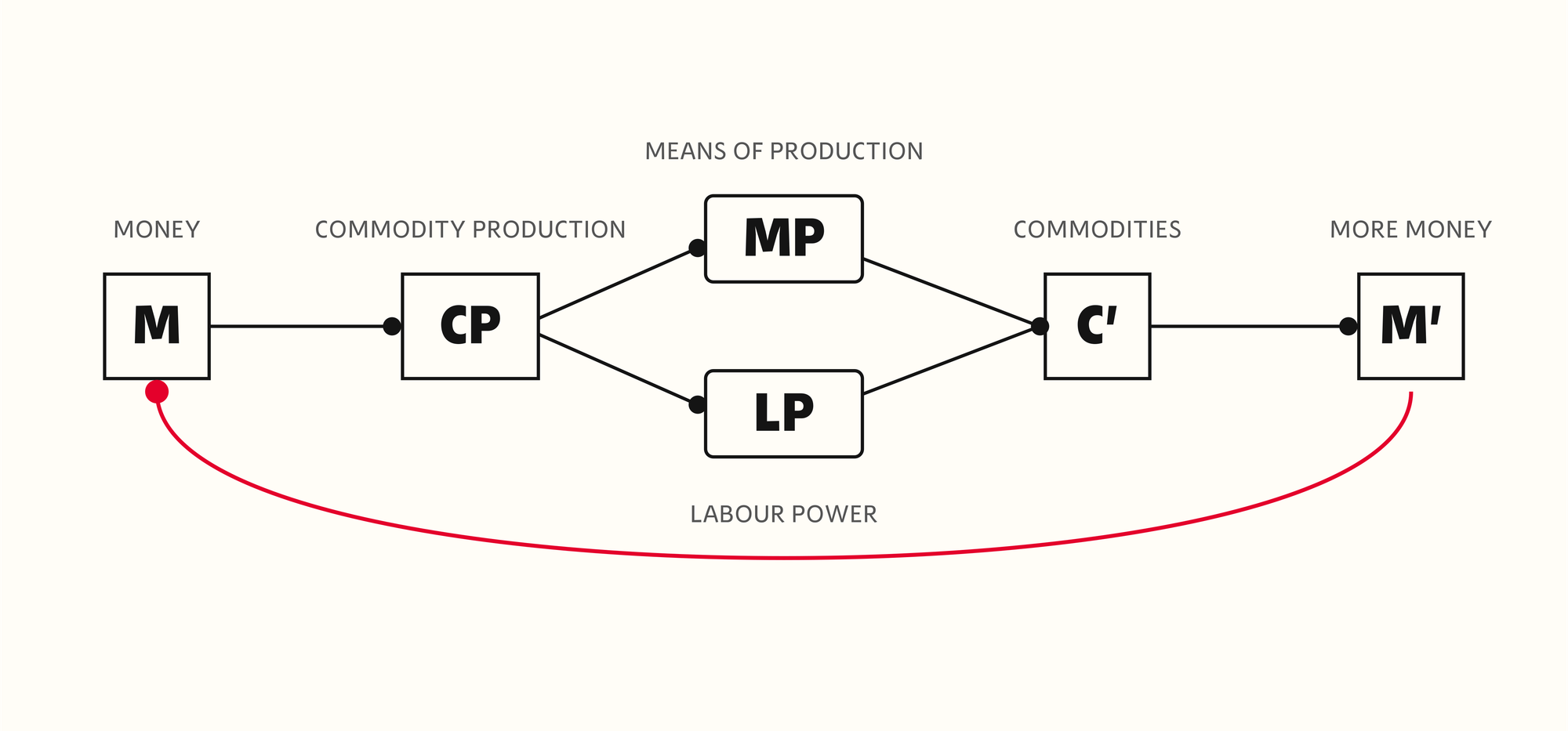
This model enables optional reclusion. A type designer could work in focused obscurity, release through a distributor, and trust that the commercial infrastructure would manage the relationship they'd rather not. You didn't need to know your end users. Your distributor did, approximately. The visibility "problem" was delegated in a way that graphic designers, for example, never had such luxury. Maybe you'd end up in a movie or something, or someone will ask you what you do and you get to blow some minds at the conference city dive bar, but type designers by and large don't need to know (or care) who's using their fonts. The visible type designers are the ones that try, and increasingly, because of the explosion of access in education and market to designers wanting to transition to type, the ones that need to be.
The arrangement was always imperfect. Distributors serve their own commercial interests, not the designer's. A font that sells reliably at a low price serves the distributor's model better than one that makes a genuine contribution to visual culture and sells rarely. The incentive is catalogue breadth and transaction volume. Distinctiveness matters only insofar as it generates revenue. Both parties needed licensing income, and that shared need created enough functional overlap to sustain the relationship without either party looking too hard at the terms.
Consolidation also has its consequences. Monotype spent two decades buying the layer it operates in, MyFonts, FontShop, Linotype, URW, Hoefler & Co., until it became the largest distributor by a wide margin. The distribution layer contracted, and the commercial logic sharpened. The designer's dependency on distributor relationships increased exactly as the distributor's need for alignment with designer interests decreased. Their visible efforts to partner with foundries all over the world may be a response to this, or at least a good side effect of something else.
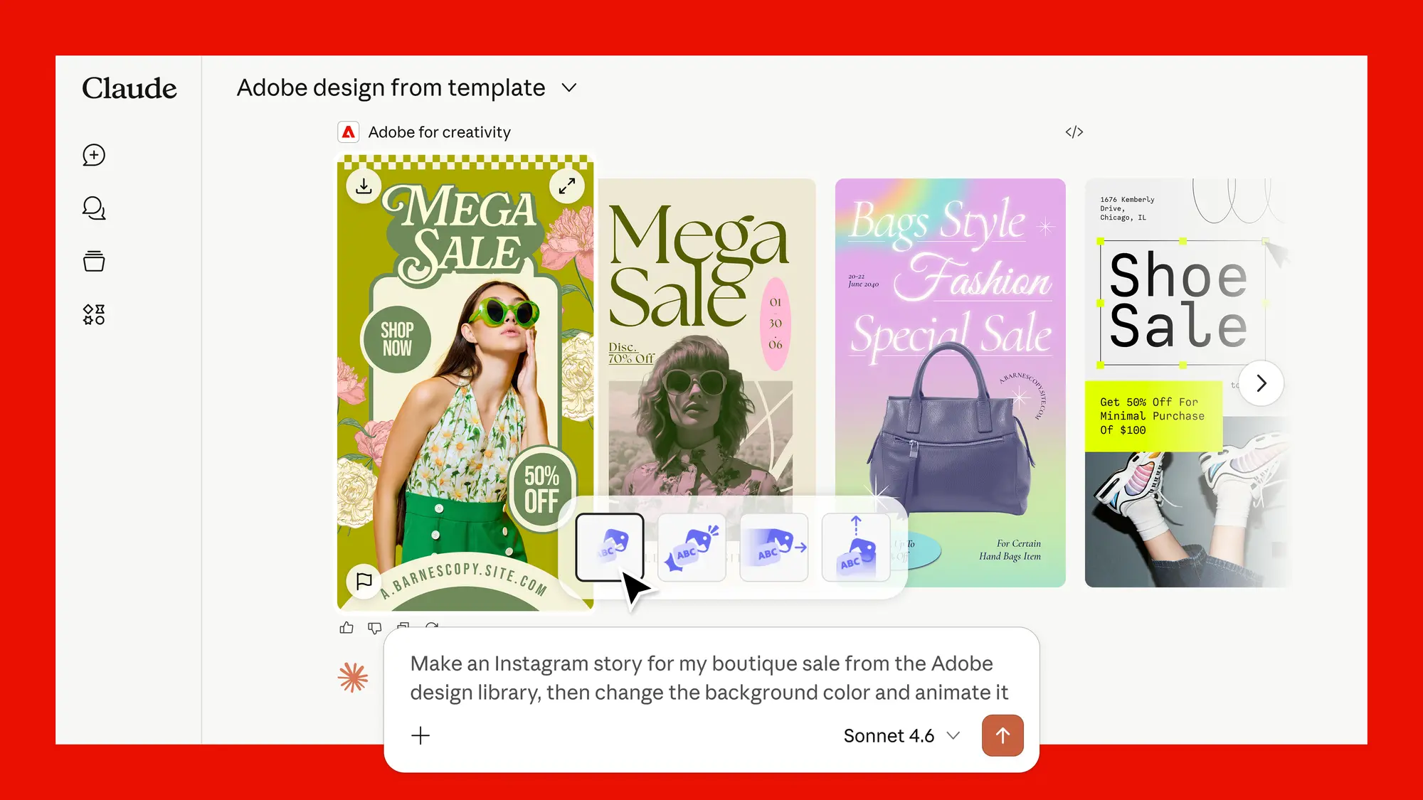
The same logic is already visible a layer up: The tools designers use to make the work are consolidating around a handful of model providers, who integrate with the established platforms and then ship products that compete with them: a partner one quarter, a rival the next, while the platforms that survive do so by becoming the engine underneath the AI rather than the thing in front of it. Type distribution sits below that layer. There's little reason to expect the pressure to stop at the border, and it reads less like an anomaly than a preview.
The arrival of AI into this system hasn't disrupted the distributors; if anything it can create a sense of security around their jobs becoming easier, and their performance more efficient. What AI has done is make those distributors more efficient at pursuing the commercial logic they already had, and made the consequences of the existing misalignment considerably more severe.
This works through two mechanisms that happen to push the same way. The first sits inside the platforms. A distributor's recommendation engine doesn't need to know anything about the web; it optimises on first-party data, what sells, what gets licensed, what converts, and surfaces more of it. This isn't taste; it's throughput, and throughput rewards what already moves.
The second sits outside the platform, in the generative systems designers and their clients increasingly consult. Ask a model what typeface suits a project and it answers from what has accumulated presence across the web: Wikipedia citations, forum threads, search prominence, usage in widely-circulated documents. A typeface with broad web presence registers as significant. One without it simply cannot, regardless of the actual work.
The two don't share a codebase, but they share a bias. One amplifies what already sells; the other amplifies what's already visible. For most typefaces those are the same thing, and a font that scores low on both has nowhere to surface.
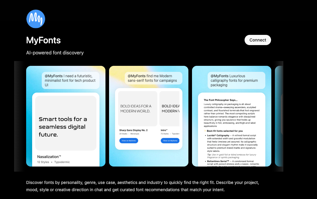
This is no longer hypothetical: In early 2026 Monotype launched an AI search that turns a described mood or brief into font recommendations across its library, and put a version of MyFonts inside ChatGPT, so a font request typed into a general-purpose model returns licensable results from the largest catalogue.
This is admirable business efficiency, but the designers most exposed by this are precisely those whose work sits outside the common orders of both aesthetics and distribution: distinctive in form, and often released through channels that aren't the dominant catalogues.
Type design is often built around specific historical references, regional printing traditions, unusual structural premises: often manifesting in work that departs decisively from consensus. It's also the work least likely to accumulate broad web presence. The audience for a text typeface derived from a particular strand of Central European blackletter is real, but it's small. It doesn't generate Reddit threads. It isn't cited on Wikipedia. It won't surface prominently in an AI recommendation unless someone has already done the cultural work of situating it across multiple channels. For a niche typeface design, that rarely happens at sufficient scale. This isn't universal, obviously: if you're DJR, this isn't your problem.
Distributors have always preferred the broadly commercial over the distinctively interesting, but that preference operated at human scale. A catalogue editor could override the commercial pressure with individual taste, and a large enough catalogue benefited from genuine variety. AI-mediated signals don't have taste. They aggregate what's already visible and amplify it. The filtering layer has become more efficient at filtering for the same things, and less able to correct for its own blind spots.
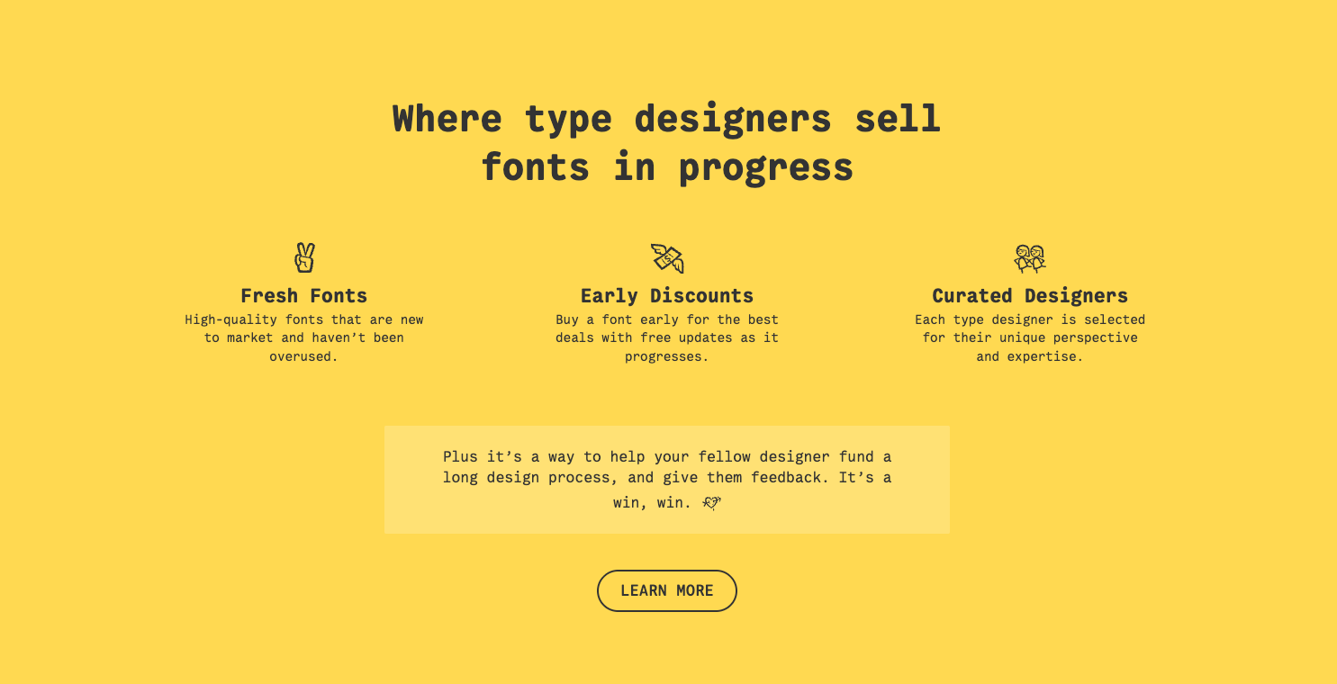
A handful of platforms have emerged in response, each answering a different part of the problem. Future Fonts lets designers sell work in progress directly, priced as the typeface develops rather than at finished release. I Love Typography runs a curated marketplace for independent foundries and, through its ILT Trust arm, offers them business services whether or not they sell through the shop. Fontstand reworked the transaction itself: fonts rent by the month at a fraction of the license price, convert to ownership after a year, and return fixed royalties rather than streaming-style payouts.
What these share is an attempt to reintroduce the designer-purchaser relationship the catalogue abstracted away. The Type Founders answers differently: it acquires foundries outright—with names including P22, Lanston, and Hamilton Wood Type, and runs them as a group so the designers can return to drawing rather than administering a business. From the outside, the structure points at relief rather than extraction, though the two look identical until the group needs to grow. Whether it can hold that line then is the open question, and a genuinely interesting one.
The question worth dwelling on isn't whether AI will replace type designers or ruin type design. The more useful question is what AI-amplified distributor logic does to the economics of distinctiveness: designers who depended on catalogue visibility for discovery, subscription revenue, and the distribution infrastructure maintaining broad range are now operating in a system where that infrastructure is working more efficiently against their interests. The distributor's interests haven't changed. The instrument for pursuing them has. Thus, the designer's instruments need to change, too.
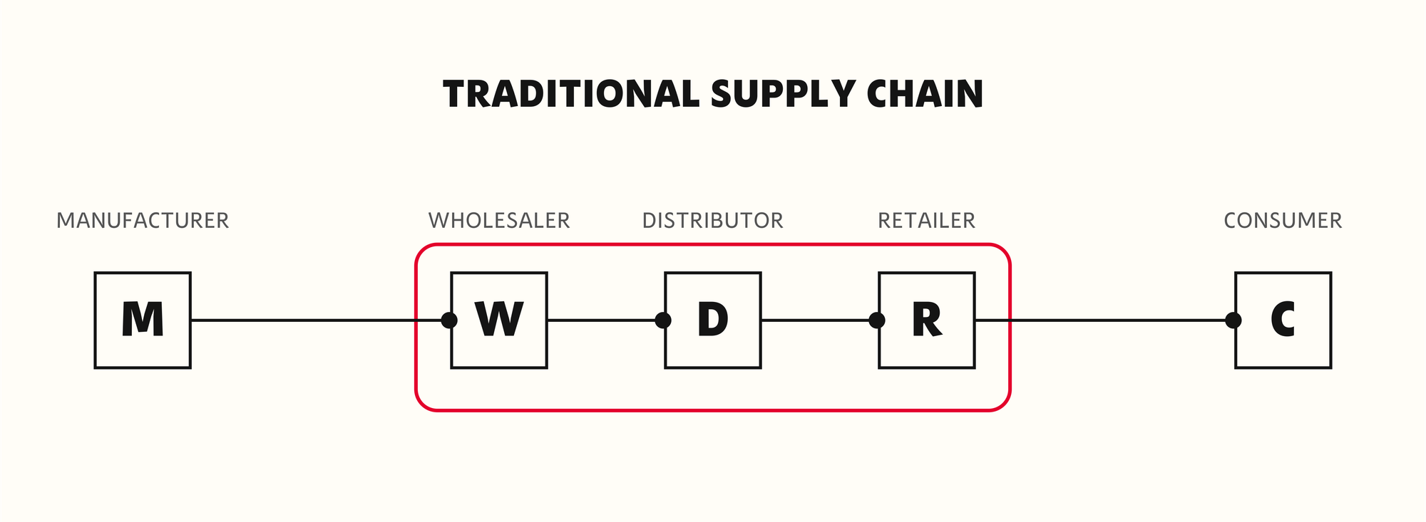
The easiest move that's available is direct: get to know to your users. Somehow, figure it out. Maybe you hate all of the Mag 7 CEOs and you want to build community on Mastodon? Go for it. Understand what designers are doing with your work. Build the kind of relationships that the distributor model made optional. It isn't easy, but if reclusion was a structural condition that system enabled, that condition has changed. As Danielle on LinkedIn once said: "If you're not networking, you're not working"
The reason to reclaim customer relationships isn't social; it's economic, and existential. A designer whose name travels through referral rather than catalogue algorithm has less riding on which way the consensus signals move. That's a meaningful structural difference, even if it's not an exit.
I've been working on a project investigating font discoverability and distribution, and talking to lots of type designers; there's obviously some concerns, but they mostly aren't about market access or money. Those things fit easily into an industry conversation, but the thing underneath it is harder to name: a fear that the work of making type is losing its human dimension. That the chain running from a type designer's decisions to a reader's eye is being replaced, layer by layer, with something that approximates without experiencing. And so much of typography is about experience.
The reclusion that made type design sustainable was never indifference. Designers who withdrew to focus on the letterform care deeply about their work, and this time of realistic robots clarifies what that work was always for: a person drawing something for another person to read. The distribution system was never built around that premise, and neither is the one being built on top of it. The human at the end of the chain was always an assumption the infrastructure made on the designer's behalf, and that assumption is now optional, increasingly unprofitable to maintain. Keeping it is on the designer now.
For a lot of designers the work was always a means to an end, and the end was connecting with people. What the moment elucidates is that the connection is now the value behind the money and the reason for the work at once. The old models kept those apart, paying for licenses and leaving the connection incidental. Having them converge is the opportunity: the rare case where the thing that sustains a practice and the thing that drew you to it are the same move. The challenge is that AI is accelerating the system that made connection optional, and fewer designers will get to make it at all, for some of whom that was the entire point.